A Year in the Life of Fringe
Fringe began his series titled FACSIMILES in June 2020. The artist’s process was to release a single print per month for a year. In content, the prints speak about the power and powerlessness of words, and serve as personal, sometimes indefinite responses to real events in his life. FACSIMILES are, by definition, ‘exact copies of written or printed material,’ and these the artist presents as messages from a place of introspection.
The series therefore functions as a long-running narrative, of sometimes subversive quotes from questioning and questionable sources. It performs as a facsimile of messages, taking us back to a time before the social media, namely, the time of the old fashioned fax, and driving us forward with cryptic clues, to the present day.
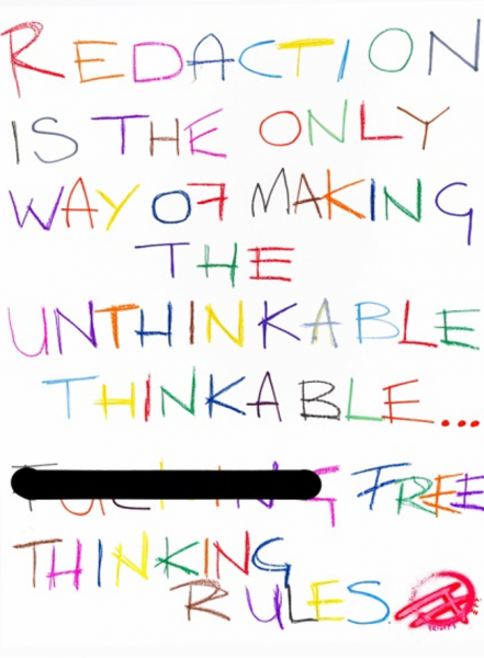
#1 REDACTION
REDACTION IS THE ONLY WAY OF MAKING THE UNTHINKABLE THINKABLE… FREE THINKING RULES
This full colour print is the first in the series and introduces the idea that ‘Words are Deeds’, the famous quote by philosopher Wittgenstein that encourages us to think before we talk. Here, Fringe the artist takes on the barriers to free speech and brings a protest message into his Pop Art, with a funny mixture of irony and satire.
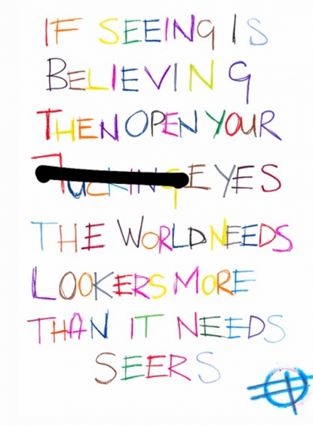
# 2 BELIEVING
IF SEEING IS BELIEVING THEN OPEN YOUR FUCKING EYES THE WORLD NEEDS LOOKERS MORE THAN IT NEEDS SEERS
This full colour print is the second in the series and rips into blue-sky idealists. It shatters dreams, yet delivers its hard-edged message without being too bleak. It muses on our electrifying present moment, a time in which people are being torn apart, and are coming together as friends and adversaries in dramatic displays of anger and revolt. It’s a colourful appeal for rational thought.
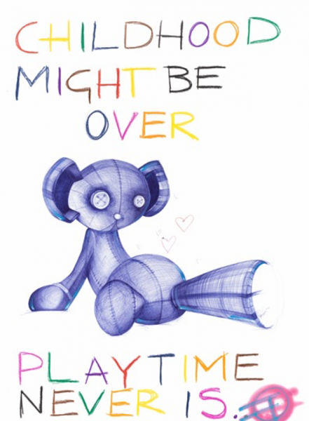
#3 PLAYTIME
For the third in his series of colour prints, to be rolled out monthly over a year, Fringe magnifies the fabulous message of Pop, while scaling back on text.
The over-handled toy, that has found its way into the most recent works, is a vestige of youth. It’s a symbol of a babyhood well-spent, a signal that the child is about to take its next step.
Like most abandoned toys it lies in the corner, waiting to be recycled or dumped. The artist reflects on this fragment of lost innocence, while asserting that it is the Pop artist himself who must evolve, to carry on with his task. It’s a time for joyful pastimes, and new objects – to hit the accelerator, and play.
This is a real note to self.
#4 THE BIG APPLE
Print No. 4 in the Fringe Facsimile series is released on September 11 and is a direct reference to The Big Apple. By shifting focus to New York and American corporate culture, on this symbolic day, Fringe investigates whether the golden ratio, or the divine proportion as it’s called, continues to deliver on our artistic and cultural dreams. The equations add a fun, but cryptic, element of inquiry: in order to succeed would you bring an apple for teacher, to school?
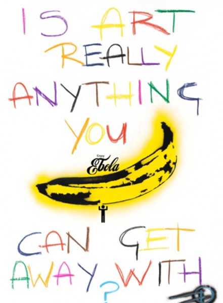
#5 IS ART REALLY ANYTHING YOU CAN GET AWAY WITH?
Fringe Facsimiles are brought together in a series of large colour prints by an artist forever questioning the boundaries, and bullshit scenarios, of contemporary art.
Andy Warhol’s 1967 banana screen print, created for The Velvet Underground’s first vinyl album, is shamelessly plagiarised, seemingly answering the question: ‘Yes, Art can be everything you can get away with.’ Fringe brilliantly plays on the irony of presenting unlimited possibilities within a limited print edition.
Art lovers, and independent rock music lovers, will know that the banana image was the cause of a copyright lawsuit by the musicians Lou Reed and John Cale, against the Andy Warhol Foundation, in 2012. Provocateur Fringe steps into the fracas with his own remix of pop art’s fruity icon, now adorned with a Coca-Cola logo, amended to reflect the horrors of Ebola, and a male toilet sign figure holding up the whole design.
For Fringe the sky is the limit, and his artistic practice knows no limits at all.
#6 ELEVEN ELEVEN
FRINGE FACSIMILES is a series of colour prints, rolled out monthly over a year, by an artist forever exploring the fault-line between Pop and Life. Pop Art may depict a wonderful world of heroes and heroines, but FRINGE is here to remind us that the most heroic acts happen, not in another universe, but right here at home. Print No.6 in the series describes the games parents play to feed their kids. Anyone who’s flown a spoon into a baby’s open mouth will know the drill. But there’s more: FRINGE’s signature fried egg plays a starring role. Its yolk rises, and falls into its white albumen like an eclipse. Dated 11/11, the print is an abstract portrayal of suburban bliss. The FRINGE FACSIMILE series of prints is the artist’s most personal work to date, marking a departure from his epic, unique works about global popular culture. Moving to smaller statements about the pursuit of happiness, through direct address, FRINGE shifts focus from Pop to real life.
#7 MEIN EYGENE OIGEN
As FRINGE’s year long project (one print a month) rolls out, a couple of things have become apparent: 1. Texts are heavily influenced by the social media. 2. The works obsess about the present, a big preoccupation in Pop Art.
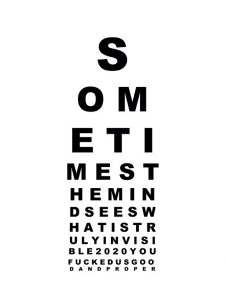
FRINGE’s forms take their cue from graffiti and graphic art. Each print functions as a pop poster with a message. And now he turns his eye to the eye chart. Or the chart of the mind’s eye to be exact.
Collectively, we may have seen the catastrophic year ahead coming. But we chose to respond in so many different ways, to make the crisis visible, that we pulled in opposite directions.
As 2020 draws to a close we remember how it screwed us. The new artwork makes reference to the small print. Like a contract we signed unwittingly, we are now bound by sinister little clauses we cannot escape from.
But if you look real close you will see how art can take away the blind spots.
#8 AUTHORITY VS VELOCITY
FRINGE’s latest full colour print is yet another milestone in his year long project of offering a single editioned work every month, as a journey of the heart.
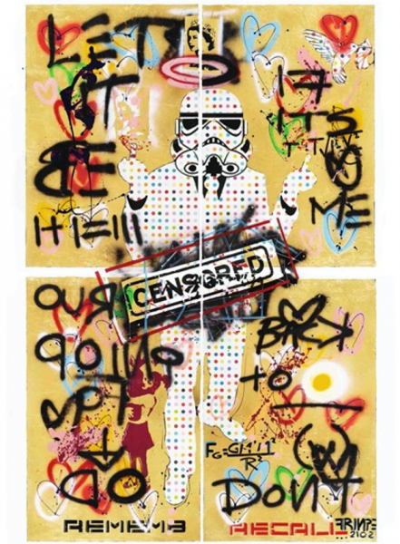
His latest print, titled Authority vs Velocity, is a twisted portrait of a Stormtrooper, decorated with Damien Hirst’s polka dots. It references a 2.2 metre mixed media earlier work, about the obtrusive and seductive pull of power.
In this anarchic, but propagandist image, from the global popular culture, we are asked to pay lip service to the Sovereign (Queen Elizabeth II), whose ancient currency still rules the waves.
January is the month of renewal — but in the common human experience it is also one of recommitment to established values. And a return to the old life.
The print text questions the difference between ‘remember’ and ‘recall’. The overall tone of nostalgia is enhanced by the use of gold leaf, reminding us of past masterpiece; and paying homage to one of Fringe’s idols, Gustav Klimt, with his iconic work Portrait of Adele Bloch-Bauer.
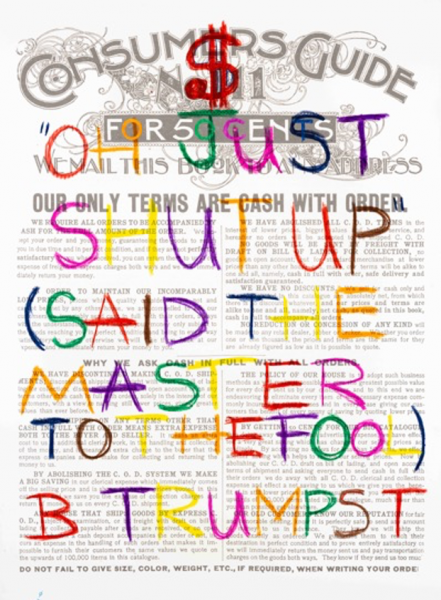
#9 OUR ONLY TERMS: ‘OH JUST SHUT UP (SAID THE MASTER TO THE FOOL) B TRUMPST’
The latest print by the artist FRINGE for February 2021 takes a side swipe at the world of big politics, and the spats that held humanity spellbound in the period preceding. Using the matrix of a vintage Sears almanac, a consumer guide from the times before, he describes the fall of the power of cash and the rise of the currency in its most fundamental form — art.
The text asks us to address who the Master is at the helm of the new world order. And if we identify the master, then perhaps we can identify the fool. We wonder who is marching to the beat of whose drum?
The 1905 Sears Almanac provides the perfect backdrop to the text giving us cause for introspection: the artist questions when it all changed — and when was cash suddenly not king. And therefore, FRINGE wonders, if it’s true that the most viable economy now is in the state of the art.
#10 LEISURELY MANIFESTO
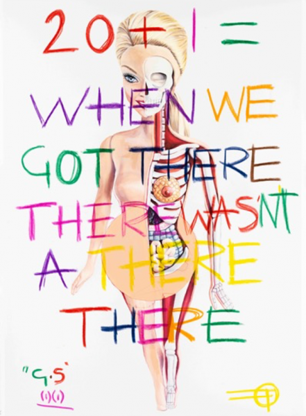
20 +1 = WHEN WE GOT THERE THERE WASN’T A THERE THERE.
The unlikely attraction of two global icons: Jason Freeny and Gertrude Stein forms the basis of the latest FRINGE print. #10 of 12 in the Facsimile series makes oblique reference to the artist’s previous print claiming ‘2020 you fucked us good and proper.’
Now, the latest work reflects on the global expectation that 2021 would be a year of massive change. Paraphrasing the words of the great art collector, Gertrude Stein, we are reminded that the more things change, the more they stay the same.
The art of Freeny makes an appearance – and in this context reminds us that appearances are not everything. Even the stereotypical, pristine beauty of a Barbie Doll is upstaged by the reality that all humans are really made up of blood and guts.
#11 F&*K THIS NOISE [FTN]
FTN is the latest print by Fringe in his Facsimile series, created in a remarkable year of crazy art production, and even crazier human interaction.
In his developing sketchpad style, Fringe gets to the heart of the matter. The series is the artist’s most personal work to date. The naked heart signals an open wound, revealing deeply held private stuff.
Pinocchio is bleeding. We assume from the tale that the wooden kid lacks blood. But Fringe seems to be asking whether children have the heart to understand the the parental world. FTN is about the petulant anger of children, when they are victims of adult noise.
In his Facsimile series Fringe releases one print a month for a year. FTN is the eleventh in the series that will end in May 2021.
#12 I DONT GET LOST
For the final print in his Facsimiles series, Fringe continues his exploration of the visual codes and symbols associated with childhood.
In the year-long rollout, of one print a month, he has extended his ambivalent relationship with childish dramas. Toys, treats and tributes have been central to the visual narratives he has expanded upon.
Now, in the final print, produced on found paper, Fringe works through the suggestion that childhood is a time of giving and receiving. The sickly sweet, moulded ice cream forms the visual basis of the composition.
In the final print it is raining frozen treats. They’re coming from every side. The children are hysterical as they holler: ‘I scream, you scream, we all scream for ice cream!’
But in the deluge the artist finds himself, with the assuring text: ‘I don’t get lost.’ They are the last words in a year of messages.


![#11 F&*K THIS NOISE [FTN] #11 F&*K THIS NOISE [FTN]](https://fringetheartist.com/wp-content/uploads/2021/07/Fringe-Facsmile-11-1-441x600.png)
